Viceland - Network Identity
Viceland is a multinational TV network geared towards millennial audiences. Their content focuses mainly on lifestyle, with unfiltered shows like Weediquette and F*ck, That’s Delicious. The network’s brand is known for being blunt, unadorned, and mostly, Helvetica Bold. Typography plays a large role in their brand identity and I wanted to highlight that in this piece by using kinetic typography to breakdown the network into its utmost fundamental sensibilities.
Social Deliverables
Along with the traditional broadcast format, I also created social mock-ups for Instagram. Enjoy.


Type Animation
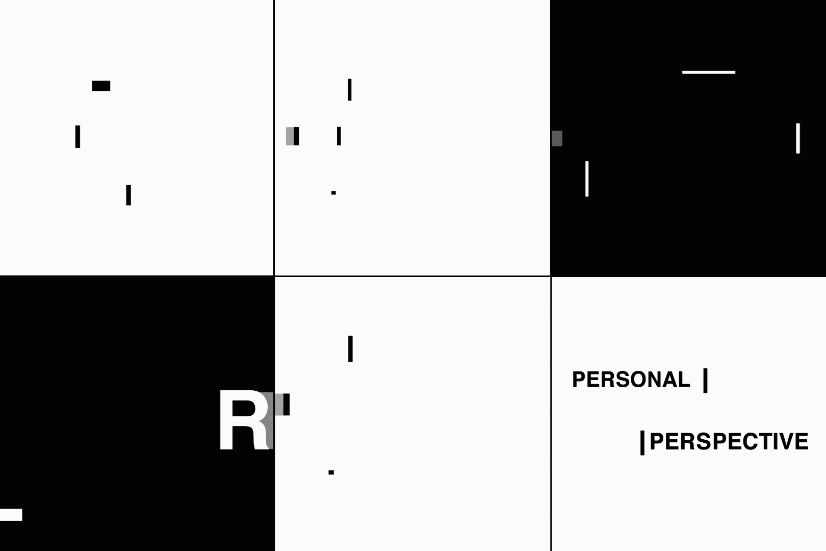
Animating typography is one of my favorite things to do. Most times, I approach type animation with a very delicate, clean treatment. However for this piece, I wanted to experiment with the medium and push the boundaries. I played around with breaking the letter forms, influenced by David Carson’s experimental typography. When it came time to animate, I wanted to show a choppy motion, cutting back and forth between type resolves. I wanted the type to have variety in scale, to feel in your face at moments. These were the final type treatments.